Design system · Scale & delivery
Turning recurring product decisions into a shared system
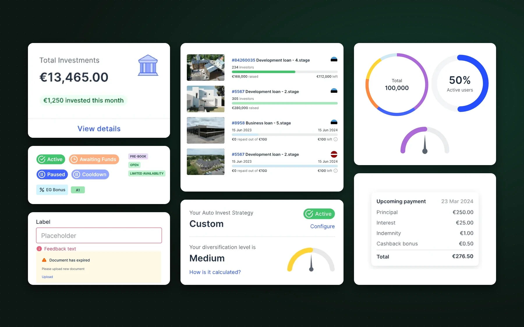
I built Estateguru’s design system from scratch in Figma, using variables, design tokens and reusable components to support investor web, mobile and internal tools. Frontend engineers then built it as a React component library, documented in a public Storybook.
01 · Problem
Visual consistency was only the visible symptom.
The previous UI library lived in Sketch. Rebuilding it in Figma was a chance to organize styles, component behavior and responsive rules around the needs of the actual product, rather than copying an old asset library.
Create one reusable design foundation with clear building blocks, product-specific patterns and implementation-ready states.
02 · Research
Before building anything, I studied how mature systems solve the same problems.
I reviewed three public systems that set the standard for product UI at scale: IBM Carbon, the Atlassian Design System and Google’s Material Design. I compared how each one names tokens, structures color and type, documents component states and connects design files to code, then kept what fit a regulated investment product.
Tokens named by role (text, background, layer, focus) instead of raw values, and one grid and spacing scale shared by design and code.
Semantic color tokens with a clear intent, such as subtle text or selected background, a defined elevation scale and guidance written for product teams.
Tonal ramps built from a key color, a type scale named by role, and interaction states expressed as overlays on top of a color.
Two-layer color naming, numbered tonal ramps, role-based type styles with mobile sizes, and hover and focus overlays as tokens.
03 · System principles
I built from foundations to page-level patterns.
Account for loading, empty, error, disabled and status states, including responsive layouts.
Start with small reusable components, then combine them into richer controls and modules.
Define color, typography, spacing and other reusable values through Figma variables and design tokens.
Review built screens with engineers and refine components when real product needs expose gaps.
04 · Color
Brand names for people, semantic roles for code.
The palette works in two layers. Ten brand colors carry human-readable names that designers, marketing and product can talk about. Every color used in the interface is then referenced through a semantic role that matches code usage, so a designer picking “text secondary” in Figma and an engineer using the same token get the same result, and a later brand change touches the values, not the screens.
- Ribbon Blue
#244CFF - Imperial Blue
#212F40 - Frost Blue
#CEE8F4 - Cotton Blue
#F2FBFD - Neon Green
#DBFF76 - Forest Green
#1B9D46 - Bicycle Yellow
#FFE68D - Pink
#FCD9D9 - Vivid Orange
#FE5F00 - Lavender
#AC69D9
Tonal ramps
Ribbon Blue expands into a primary ramp from 50 to 900, plus in-between 75 and 550 steps. Gray runs from 25 to 900. Success, warning and error each have their own ramp, and five decorative ramps serve illustration and highlights.
100500 · Ribbon Blue900
Roles and contrast
| Use | Token | Value | On white |
|---|---|---|---|
| Body text and headings | Text Primary | #212F40 | 13.6:1 |
| Supporting text | Text Secondary | #58626F | 6.2:1 |
| Links and actions | Text Interactive | #244CFF | 5.9:1 |
| Error icons and borders | Error 400 | #CF405C | 4.6:1 |
| Success icons and borders | Success 400 | #1B9D46 | 3.5:1 |
| Warning icons and borders | Warning 400 | #FE5F00 | 3.1:1 |
Text and action colors pass WCAG AA for body text, and white on a Ribbon Blue button reaches 5.9:1. Status colors at 400 clear the 3:1 minimum for icons and borders; their 50 tints carry message backgrounds. Interaction states are tokens too: hover and focus are 4% and 8% overlays of Ribbon Blue, the focus ring is Ribbon Blue at 25%, and the modal backdrop is Imperial Blue at 50%.
05 · Typography
Two typefaces, one scale, every style sized for desktop and mobile.
Wermut, a display face with character, is reserved for hero and page titles, where the brand speaks. Inter does the work everywhere else: its tall x-height and distinct digits keep dense financial figures, tables and form labels readable at 12–16px.
| Style | Desktop | Mobile | Typeface |
|---|---|---|---|
| Hero H1 | 64 / 80, −1.4 | 44 / 52, −1 | Wermut |
| H1 | 56 / 68, −1.2 | 40 / 48, −0.8 | Wermut |
| H2 | 36 / 48 | 32 / 40 | Inter Semibold |
| H3 | 28 / 36 | 24 / 32 | Inter Bold |
| H4 | 24 / 32 | 22 / 28 | Inter Medium |
| H5 | 18 / 28 | 18 / 28 | Inter Medium |
| P16 body | 16 / 24 | 16 / 24 | Inter Regular |
| P14 body | 14 / 22 | 14 / 22 | Inter Regular |
| P12M caption | 12 / 18 | 12 / 18 | Inter Medium |
| B14M button | 14 / 24, +0.2 | 14 / 24, +0.2 | Inter Medium |
Style names encode size, weight and line height, such as P14SB or B14M_20, so a token read in code tells an engineer exactly what it renders.
Headings step down on mobile; body text stays at 14–16px so reading comfort never drops on a phone.
Negative tracking only on the large Wermut sizes, +0.2px on buttons for legibility at small sizes, zero everywhere else.
A 4px base, 12 columns at 1200px and 960px, 6 on mobile; five standard shadows and four transparency steps.
06 · Architecture
Generic components and fintech patterns live in one library.
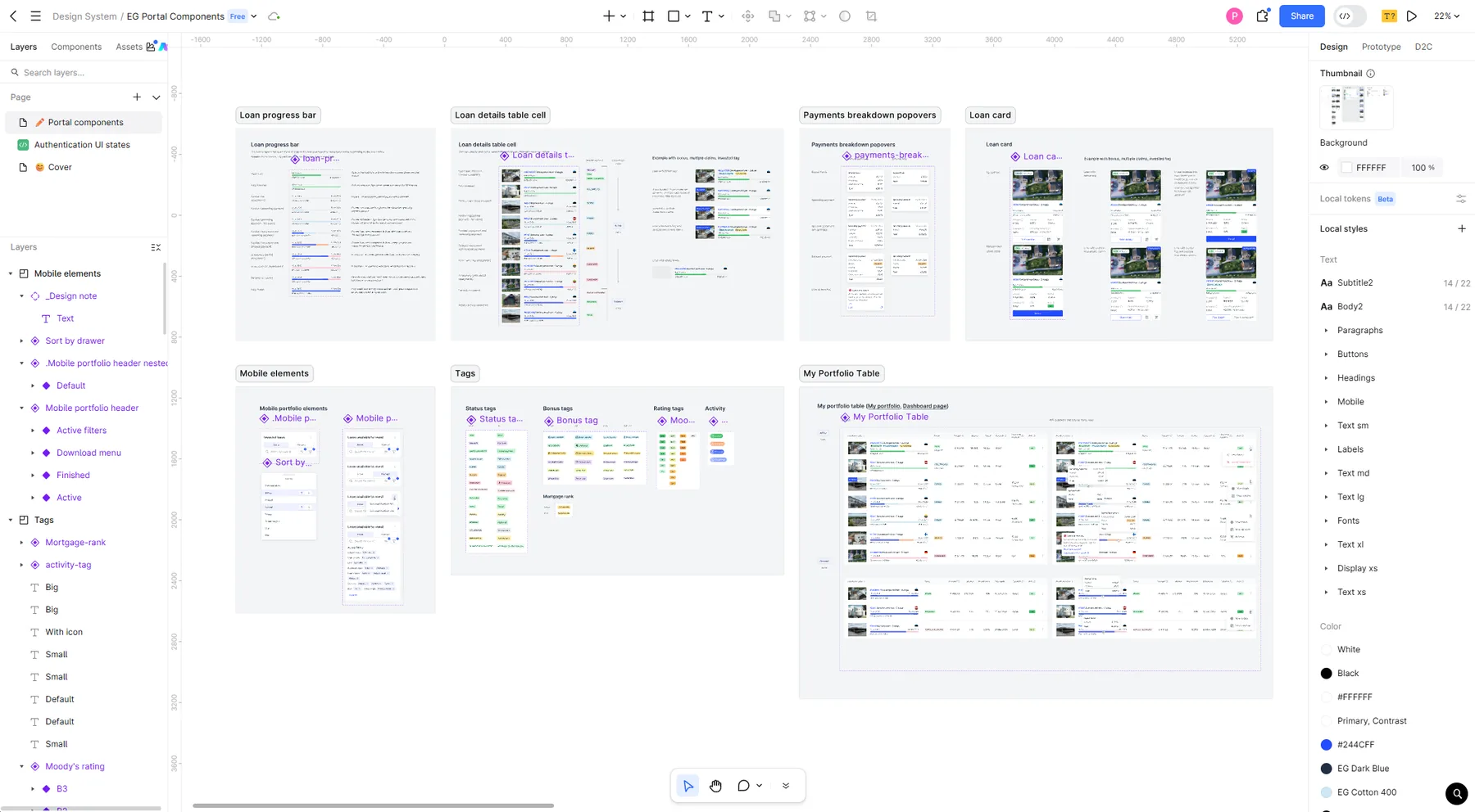
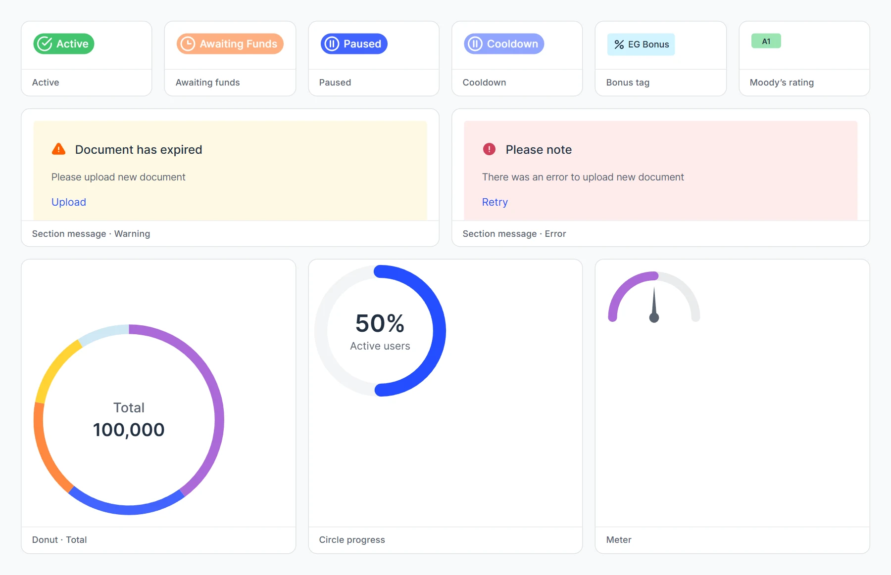
The system follows a practical hierarchy: foundations → layout primitives (box, stack, grid, page and section headers) → form elements → navigation → overlays → presentational components → data visualization. Product-specific components sit next to the generic ones instead of being rebuilt per page: activity, bonus and status tags, a Moody’s rating tag, primary-market loan tables, meters and donut charts for portfolio data.
07 · Figma to code
The states specified in Figma became the coded stories.
I specified components with their states and responsive rules in Figma, clarified implementation details with frontend engineers and reviewed shipped interfaces against the design. The engineers built the system in React and TypeScript, with Emotion for styling and Nivo for charts, and documented it in Storybook.
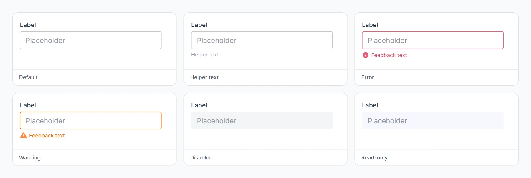
Because states were part of the design spec, the code follows the same matrix. A form field exists as default, with helper text, error, warning, disabled and read-only, most of them with and without a label, so nobody has to invent a missing state during a sprint.
- Component states and responsive expectations defined before build.
- Shared token names between Figma and code.
- Design review during implementation.
- Library updates as new product patterns appeared.
08 · Impact
A system that supported product delivery, not a separate design-system project.
The rebuilt Figma library provided shared foundations, reusable components and responsive specifications across the investor portal, mobile app and internal interfaces. In code it is a public reference: 56 components, 6 layout primitives and 5 foundation pages, with more than 400 documented states and variants.