Product snapshot · 0→1 mobile
Designing Estateguru’s first mobile investment experience
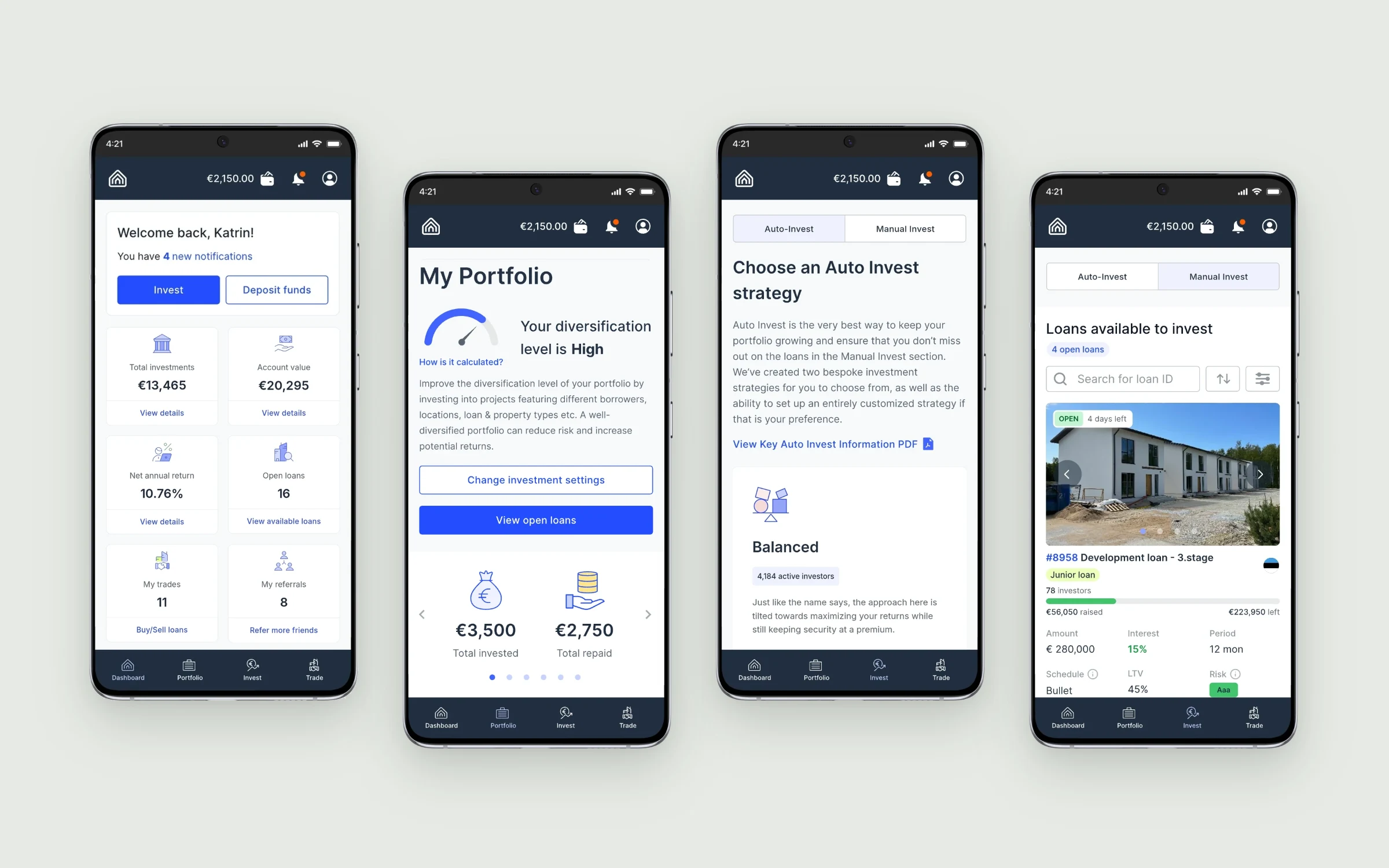
I designed all screens for Estateguru’s first dedicated mobile investor app, reorganizing the product around Dashboard, My Portfolio and a unified Invest experience, with platform-aware interactions for iOS and Android.
Challenge
A dedicated app, not a compressed desktop portal.
I designed the information architecture and the complete screen set. The app is organised around four tabs: Dashboard and Portfolio for frequent checks, Invest for putting money to work and Trade for the secondary market.
Dashboard for the overview, Portfolio for holdings, Invest for investment tasks and Trade for buying and selling loans.
Auto Invest and Manual Invest share one screen, switched by a control at the top.
Adapted navigation, controls and states for iOS and Android; Android design followed Material Design guidance.
Tested layouts and interactions on physical iPhones and Android smartphones, then refined the screens.
Overview
Status first, detail on demand.
Most sessions are quick checks. The two overview screens answer “how is my money doing?” first and keep one obvious next action within reach.
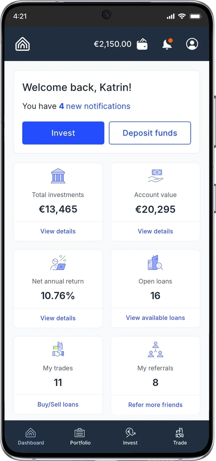
Dashboard · Status and one action first. Invest and Deposit funds sit above six summary cards, each linking to its own detail.
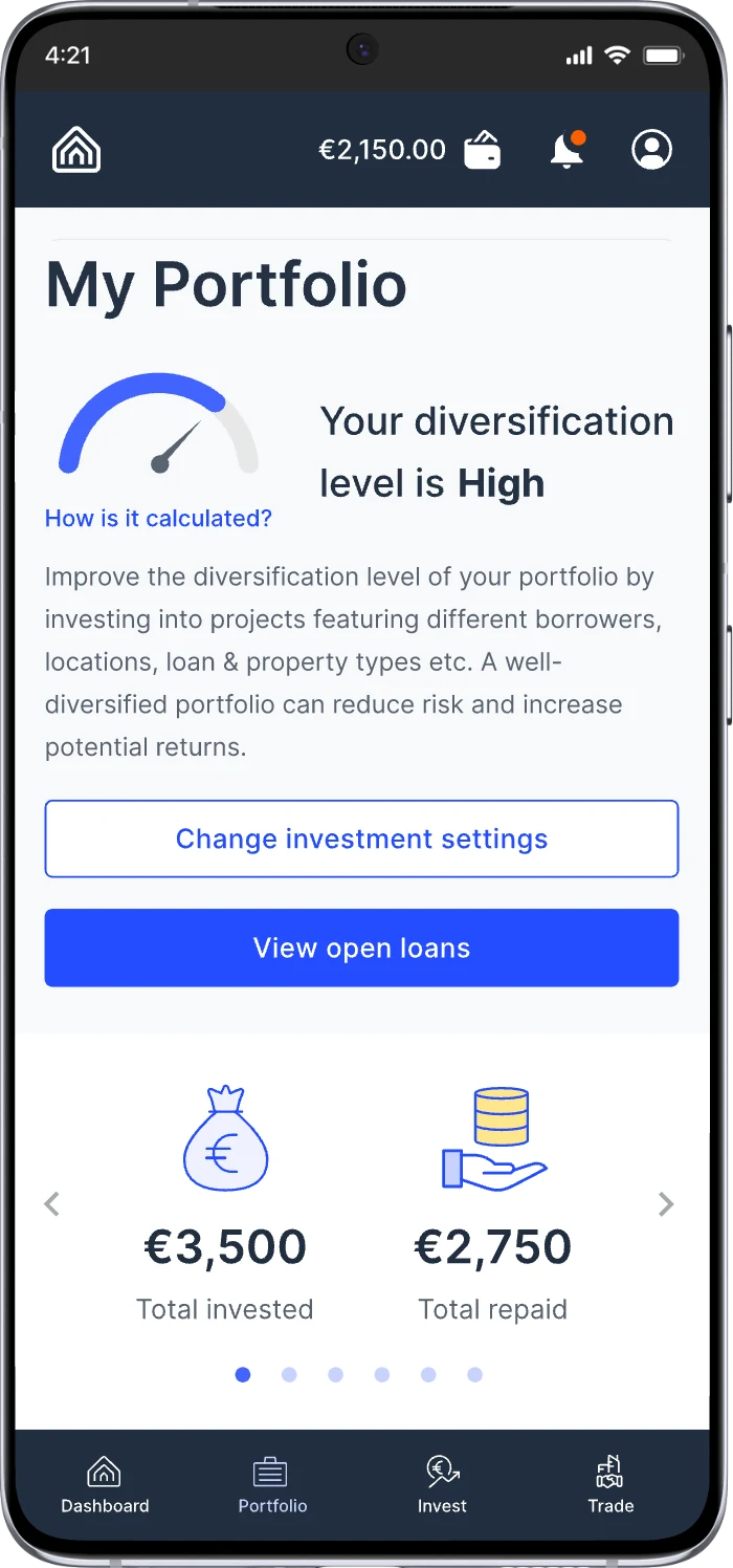
My Portfolio · Health before detail. The diversification level and how it is calculated come before totals invested and repaid.
Invest
Two ways to invest, one place to do it.
Auto Invest and Manual Invest live behind one switch, so people move between a hands-off strategy and picking loans themselves without leaving Invest.
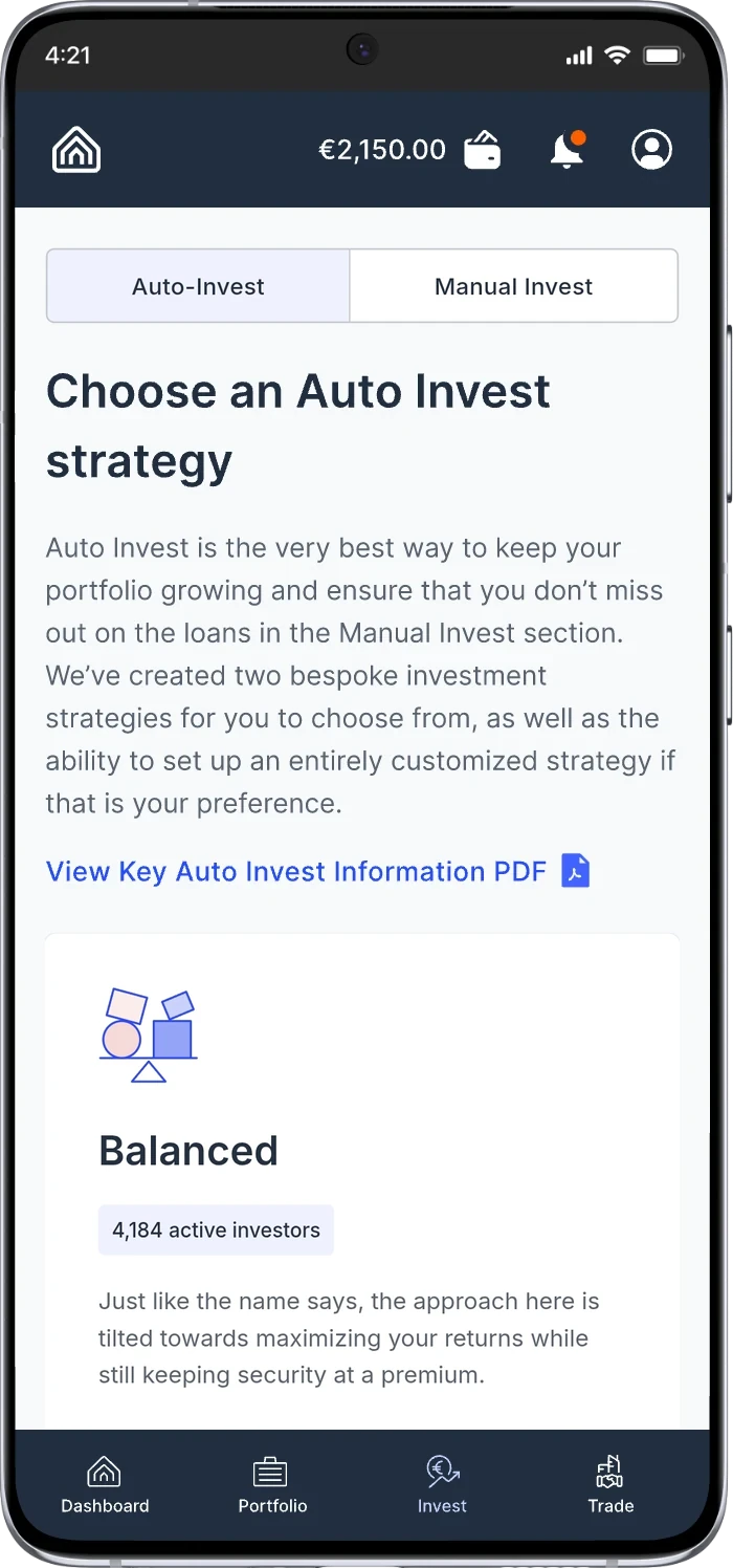
Auto Invest · Choice before configuration. Ready strategies such as Balanced explain their approach and show how many investors use them before any settings.
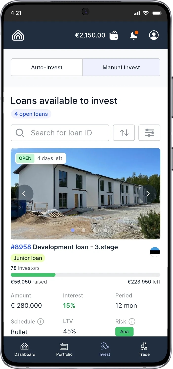
Manual Invest · Discovery without desktop density. Search, sort and filter on top; each loan card shows status, funding progress, interest, period, LTV and risk.
I designed the app screens and interaction specifications and tested them on devices; product engineering and publication were team activities. Images contain placeholder data.